

Mobile Friendly sites help turn users into customers
• 72% of users said that mobile-friendly sites were important to them
• 67% of mobile users say that when they visit a mobile-friendly site, they're more likely to purchase the service or product
o 61% of users said that if they didn't find what they were looking for right away on a mobile site, they'd quickly move on to another site
o 79% of people who don't like what they find on one site will go back and search for another site
o 55% said a frustrating experience on a (mobile) website would hurt the perception of the brand
Sources: Compuware, “What Users Want from Mobile,” 2011,Gartner, 2010; Google Mobile Optimization Webinar, 2011; Cisco, 2011
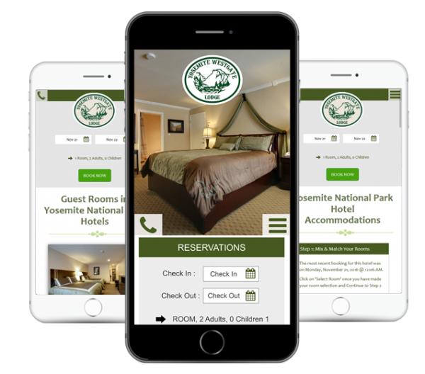
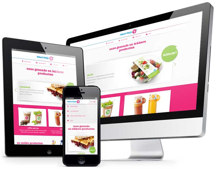
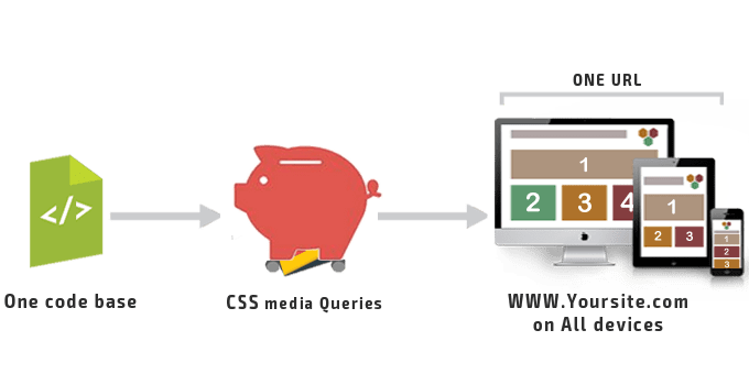
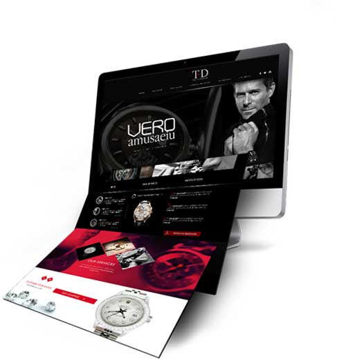
Responsive websites use CSS to scale and format content to the screen on which the site’s being viewed.
Our own website (this website you are browsing) is responsive; if you resize your browser you can see how the different page elements rearrange to better fit your window.
Responsive design usually means serving the same content on a single URL and builds on the idea of 'one web'.
For the majority of clients a responsive website is the ideal solution for a multi device world. However if the requirements of the mobile users are significantly different to those of a desktop users an Adaptive Mobile website or an App might be more appropriate.
Adaptive uses server side detection and based on the capabilities of the device detected, serves up a separate version of the website for that device.
This allows greater control over the content and features for a very different optimised mobile experience but can mean higher costs to maintain, especially given the amount of different devices on the market today.
Responsive websites work well when a site has fairly simple functionality and where the intent of users between mobile and desktop is not significantly different.
Adaptive websites work well with very functional websites and when the mobile user experience needs to be significantly different or performance is crucial i.e. e-commerce.
Over the years, we have developed over 100 successful Responsive Web Design. You can contact us anytime for a project quote!
Responsive web design allows user to adapt an optimal experience on any device it’s being accessed from. We at Des Mapp create the most professional website that is able to adjust their appearance based on screen dimensions. Our responsive web design service ensures that your business is prepared for any mobile devices as well as any screen resolutions including 1024Px, 768Px, & 320Px.
The principle stays true to the internet marketing. Building a website is basically aimed at making an online presence. As more people are accessing the net using a variety of gadgets, it is only sensible that you adjust to the trend of internet usage.
Concentration on one website, Extensive Captured Audience, Maximize Online Presence, No Duplicate Content, Lower Costs
With new technologies being introduced, it will be foolish to think someone knows everything about this filed. Constant learning is an integral part of website designing in sync with international trends. As the number of users, browsing websites on their laptops, iPads and smart phones is increasing, so is the need to keep ourselves aware of various platforms and their specific requirements. Get customized solutions by digital experts.
We design and develop customized digital solutions using the latest technologies so that we can always stay on top of trends.


At Catpops, we’ve been helping clients succeed with gorgeous branding, web design and advertising since 2009. We’re trusted experts at logo design, website development, Designing Services and Hosting in Raipur Chhattisgarh INDIA.